Visual Merchandising at the World Cup 2026
How FIFA Turns a Tournament Into a Total Brand Experience
— And what every brand can learn from it
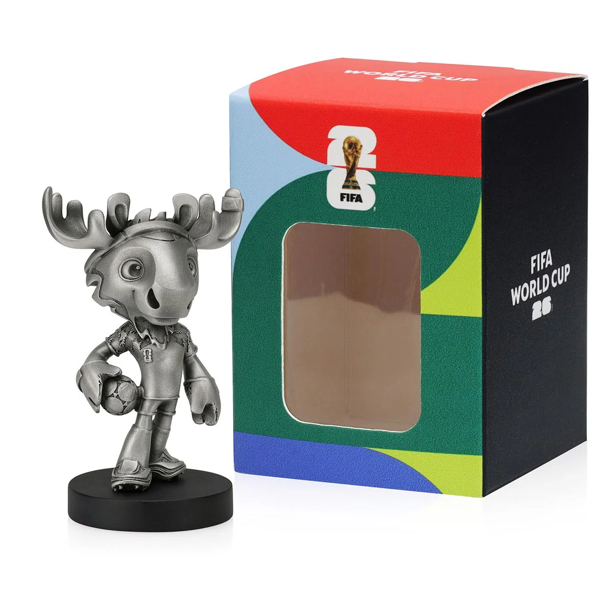
There are sporting events. And then there is the FIFA World Cup.
What separates the two isn’t just the scale — 48 nations, 104 matches, three host countries, billions of viewers. It’s the degree to which the entire commercial universe around the tournament is built and managed as a unified brand experience. Visual merchandising is at the center of that.
From the official online store to stadium retail floors to pop-up shops on the Third Street Promenade in Santa Monica, FIFA 2026 has constructed one of the most sophisticated visual merchandising ecosystems ever deployed around a sporting event.
Here’s how it works — and why it matters far beyond football.
1. The Visual Identity System: One Language, Every Surface
Everything begins with a rigorously controlled brand system. FIFA’s licensed products are built around a unified visual language — the iconic Tournament Device Pattern and official emblem — designed to capture the essence of the world’s most prestigious sporting event.
The design language uses sharp typography, full-bleed color blocks, and a modular grid that flexes across screen sizes. Bold graphic lettering mimics the shape-driven FIFA emblem — typography that doesn’t decorate, it drives the experience. Color is used deliberately: orange, navy, teal, and gold punctuate each section, connecting to each host city’s brand palette while remaining anchored to the global FIFA design system.
Whether a fan is browsing from Tokyo, walking into a stadium store in Dallas, or spotting a display at Hudson Yards in New York — the visual language is instantly recognizable. That’s not accidental. It’s engineered.
2. The Digital Store: Visual Merchandising by Emotion
The FIFA Official Store doesn’t organize products the way a typical retailer would — by price, category, or gender. It organizes them by identity and emotion.
The primary navigation is built around national pride — shop by your team, your nation, your colors. A fan arriving on the Argentina page doesn’t just see a jersey. They see themselves reflected in a curated collection of scarves, pins, keychains, and apparel that says: this is your tribe, and this is your moment.
KEY DIGITAL MERCHANDISING MOVES
- Limited edition drops treated as events, not just product listings
- Boggi Milano luxury collab elevates the store into genuine lifestyle territory
- 16 host city collections with city-specific visual design
- Homepage headline — ‘Match Day is coming. Discover the gear everyone’s after’ — urgency-led retail copywriting that mirrors the tournament’s momentum
- Nation-based browsing organized by pride and loyalty, not category
3. Physical Retail: The Experience Layer
Online is only half the story. The physical retail operation behind FIFA 2026 is one of the largest and most complex in global sports history.
Fanatics was selected by FIFA to serve as the official on-site retail licensee, managing in-venue retail operations for 104 matches across 39 days in Canada, Mexico, and the United States. In addition to in-venue retail, Fanatics built out bespoke retail experiences at official FIFA Fan Festival locations within host cities.
The approach goes well beyond selling jerseys at a concession stand. In Los Angeles alone, official FIFA World Cup 2026 retail pop-up stores opened across the region — in Los Angeles, Santa Monica, Hollywood, Manhattan Beach, and Torrance — featuring apparel, national team jerseys, accessories, mascot merchandise, and exclusive commemorative items.
In New York, the tournament’s first official retail store opened at Hudson Yards — with FIFA President Gianni Infantino attending the ribbon-cutting personally. This isn’t just retail. It’s destination retail — a statement that the World Cup has arrived and taken up permanent residence in the city’s cultural fabric.
4. The Collectibles Display Strategy: Making Products Feel Precious
Visual merchandising at this level understands something fundamental: the way a product is displayed changes how it is perceived.
Strategic merchandising, themed groupings, and varied display heights increase engagement and impulse purchases. Acrylic display cases preserve memorabilia from dust and damage while enhancing visibility and perceived value. Thoughtful display concepts create a stronger shopping experience and help products stand out during the tournament season.
When sentimental merchandise is displayed with intention, it becomes easier for shoppers to browse, connect with products, and make instant buying decisions.
This is why a replica trophy in a glass case sells differently than the same replica trophy in a cardboard box. The object hasn’t changed. The context has.
5. The Brand Extension Universe: Visual Language Beyond FIFA
Perhaps the most revealing aspect of FIFA 2026’s visual merchandising story is how far the brand language has extended beyond official channels.
World Cup merchandising has evolved into a visual language that can be reinterpreted by brands with vastly different identities. Zara launched tournament-inspired pieces referencing Argentina, Brazil, France, Germany, Japan, Mexico, and the USA. H&M unveiled its collection under the slogan ‘We All Play Together.’ Bershka, Pull&Bear, and GAP all entered the conversation.
FIFA’s global licensing program allows authorized partners to use official assets — the FIFA World Cup name, the tournament emblem, mascot, slogans, and host-city branding elements — while national colors, geographic references, flags, and football-inspired design cues can be used without official licensing.
The result is a visual ecosystem where the World Cup’s color palettes, typography, and iconography appear everywhere — from luxury boutiques to fast fashion windows — all reinforcing the same cultural moment and driving each other’s energy.
What This Means for Brands: The Visual Gift Strategy
The FIFA 2026 visual merchandising machine teaches a lesson that applies to every brand — not just sports organizations.
Visual presentation is not decoration. It is the difference between a product and an experience, between a transaction and a memory. Simply placing collectibles in sleek cases is a great start, but creating a truly dynamic display takes more — combining signature items with smaller collectibles to create depth, variety, and a stronger visual story.
For brands building gift programs around the World Cup — or any major occasion — the visual layer matters as much as the product itself. A branded gift set in a beautifully designed box, organized with visual intention, wrapped in the language of the moment, communicates something that no product spec ever could:
We thought about this. We thought about you.
That is what great visual merchandising does. It makes the recipient feel that the gift was inevitable — like it could only have been this thing, presented exactly this way, at exactly this time.
The World Cup window is open. The visual language is already in the air. The question for brands is whether their gifting strategy speaks the same language — or goes unnoticed in the noise.
At Racoob, we design branded gift experiences that are as intentional visually as they are strategically. From product selection to packaging to the moment of opening — every detail is considered.
Because presentation isn’t the finishing touch. It’s the whole point.
Let’s talk →
B2B Gifting Is Becoming a Branding Strategy
For years, corporate gifting meant generic notebooks, cheap branded products, or holiday baskets sent out of obligation.
Today, smart brands are treating gifting very differently.
Modern B2B gifting is no longer about giving products — it is about creating memorable brand experiences that strengthen relationships, increase loyalty, and reinforce positioning.
In a market where client retention matters more than ever, thoughtful gifting has become a strategic marketing tool.
Why B2B Gifting Works
Business relationships are still human relationships.
People may forget a sales pitch, but they remember how a brand made them feel. The right gift creates emotional connection, brand recall, and long-term loyalty in ways traditional advertising often cannot.
The most effective gifts are not necessarily the most expensive ones. They are the most intentional.
A well-designed gift can:
- strengthen client relationships
- elevate brand perception
- improve retention
- increase referrals
- create social sharing opportunities
- make a company more memorable
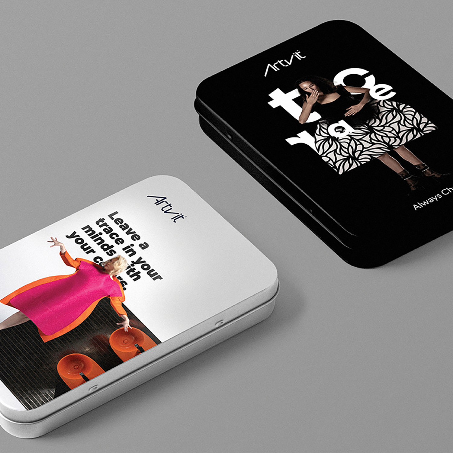
What Smart Brands Are Actually Sending
The biggest shift in B2B gifting is specificity.
Successful companies are moving away from generic promotional products and creating gifts that feel curated, personal, and aligned with their brand identity.
Airbnb — Local Experience Gift Boxes
Airbnb has sent hosts and partners curated boxes inspired by travel and local culture.
Some gifts included:
- handcrafted ceramics
- artisan coffee blends
- destination-inspired candles
- illustrated travel journals
- personalized thank-you notes
Instead of looking corporate, the gifts reflected Airbnb’s identity around culture, belonging, and experience.
Apple — Minimal & Premium Executive Gifts
Apple’s gifting style reflects its product philosophy: minimal, clean, and elevated.
Examples included:
- engraved AirPods
- premium notebooks
- sleek desk accessories
- minimalist apparel
- carefully designed launch-event kits
Even simple products feel premium because the presentation is highly intentional.
Salesforce — Event Experience Kits
Salesforce transformed virtual events into physical experiences by sending curated kits to attendees and partners.
These often included:
- Yeti tumblers
- gourmet snack boxes
- coffee or cocktail kits
- wellness products
- premium tech accessories
- personalized event materials
The goal was not merchandise — it was engagement.
Nike — Influencer & Partnership Kits
Nike creates storytelling-focused gift packages for athletes, collaborators, and influencers.
Their kits have included:
- limited-edition sneakers
- custom jerseys
- performance gear
- branded duffle bags
- motivational campaign books
- premium recovery kits
The packaging often feels collectible, which drives organic social sharing and excitement.
Notion — Creator & Community Gifts
Notion has built a strong reputation for aesthetic, highly shareable gifting.
Their creator kits included:
- elegant productivity planners
- desk accessories
- mechanical keyboards
- laptop sleeves
- artist-designed stickers
- beautifully packaged notebooks
The gifts feel like an extension of the brand itself — creative, minimal, and design-focused.
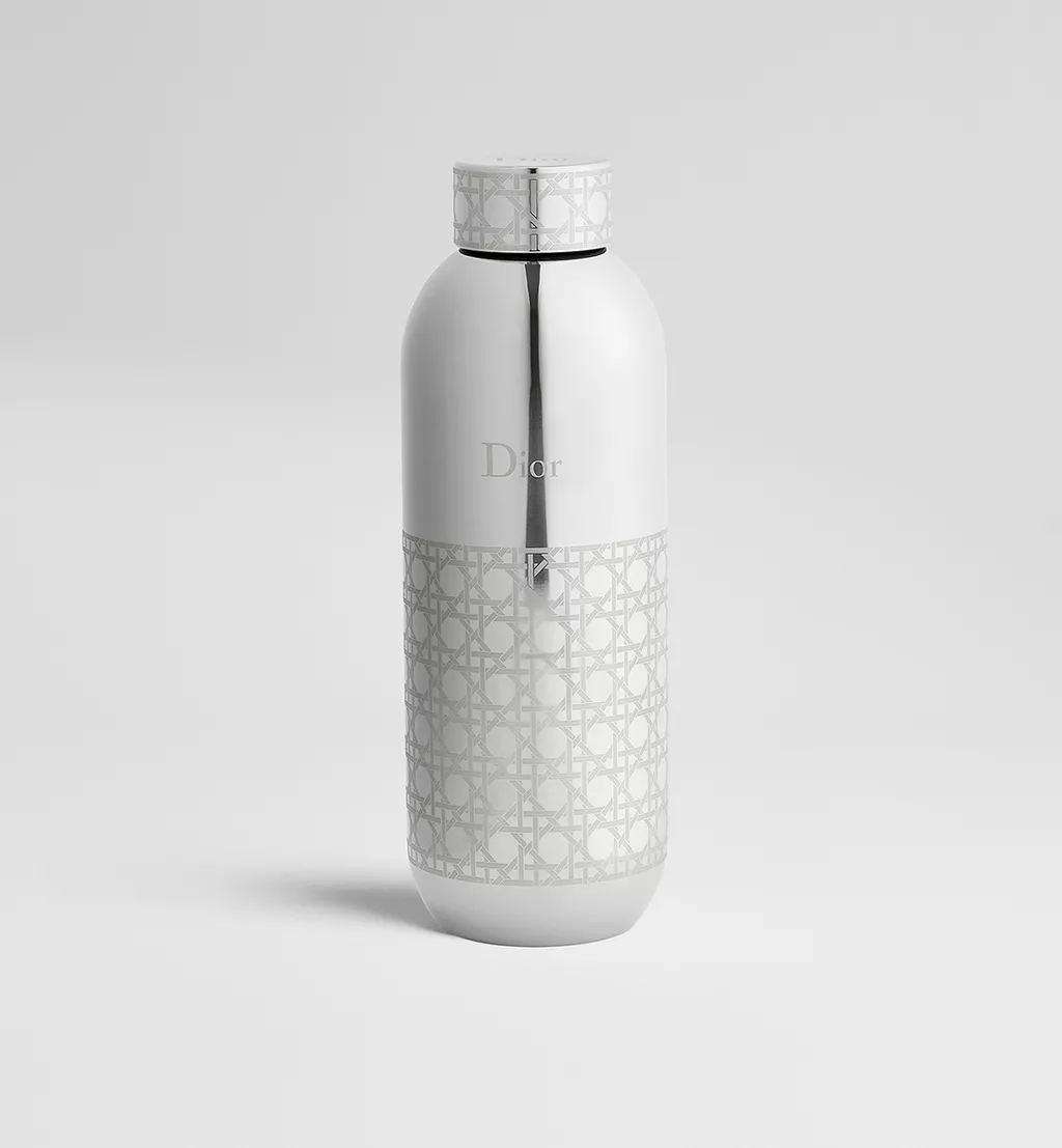
What Makes Modern B2B Gifting Effective
The brands succeeding in gifting today focus on:
- personalization
- presentation
- emotional connection
- visual storytelling
- shareable experiences
- brand consistency
A thoughtful $100 curated package often creates more impact than a generic $500 corporate basket.
Because people remember intention more than price.
Final Thought
The future of B2B gifting is not about putting logos on products.
It is about creating experiences people remember.
The smartest brands understand that every gift communicates something about the company behind it — its taste, attention to detail, creativity, and values.
And in today’s competitive market, that perception matters.
At Racoob Marketing Agency, we believe corporate gifting should feel intentional, elevated, and aligned with your brand identity — not generic or forgettable.
Whether it is a luxury client box, influencer gifting kit, event experience package, executive gift, or branded onboarding experience, the right gifting strategy can transform how people perceive your business.
If you are looking to create more meaningful brand experiences through B2B gifting, let’s connect.
Visit Racoob to explore branding, packaging, and custom gifting solutions designed to help brands stand out.
A Case Study that shows Why AI Logos are Failing the Trust Test
In early 2026, a prospective client came to us with a problem. They had a sleek, mathematically “perfect” logo generated by a high-end AI design suite. It was clean, it was symmetrical, and it cost them about $45 and three minutes of prompting.
But their conversion rate was plummeting. Despite a heavy ad spend, users were bouncing within seconds. Through a deep-dive brand audit, we showed them exactly why: in an era of “AI slop” and automated content, their visual identity didn’t signal “Innovation”, it signaled “Inauthenticity.”
Here is the breakdown of how we proved to our client that “perfect” AI identities are actually a liability in the 2026 market.
1. The “Visual Genericness” Trap
AI doesn’t create; it averages. By 2026, the internet is flooded with millions of AI-generated logos that all share the same “mathematical perfection.”
We showed our client that their logo looked like a composite of every other tech startup in their niche.
- The Problem: When every brand uses the same “clean, minimalist gradient,” no one stands out.
- The Racoob Insight: Trust isn’t built by fitting in; it’s built through differentiation. If a machine can guess your next visual move, your brand has no “soul.”
2. The Death of the “Human Signal”
Consumers in 2026 have developed a “Sixth Sense” for AI-generated assets. Research shows that 86% of consumers now say human involvement is a primary driver of brand authenticity.
We pointed out the missing “Human Signals” in their identity:
- Lack of Micro-Imperfections: Hand-rendered textures and organic line weights signal that a human made a choice.
- Contextual Blindness: The AI gave them a logo that looked “cool” but had zero connection to the founder’s story or the company’s specific cultural niche.
3. Machine-Readable vs. Human-Trustable
While we are deep in the age of GEO (Generative Engine Optimization), where brands must be “readable” by AI agents like Gemini and ChatGPT, we reminded our client of a vital 2026 truth:
“AI agents might find you, but humans still have to choose you.”
An AI assistant might recommend three companies. If the first one has a generic AI logo and the second brand has a kinetic, intentional identity with a clear point of view, the human will choose the latter every single time.
How We Fixed It: The Racoob “Art + Science” Pivot
We didn’t throw out the tech; we humanized it. We moved the client from a static, AI-generated “stamp” to a Dynamic Brand System.
- Intentional Imperfection: We introduced bespoke typography with subtle, intentional “flaws” that mirror human craftsmanship.
- Story-First Design: We spent three days on brand discovery before a single pixel was moved, ensuring the identity reflected the founder’s “Why.”
- Kinetic Identity: In 2026, static logos are relics. We built a fluid, moving identity that adapts to different user contexts while maintaining a core “Human Signature.”
The Result?
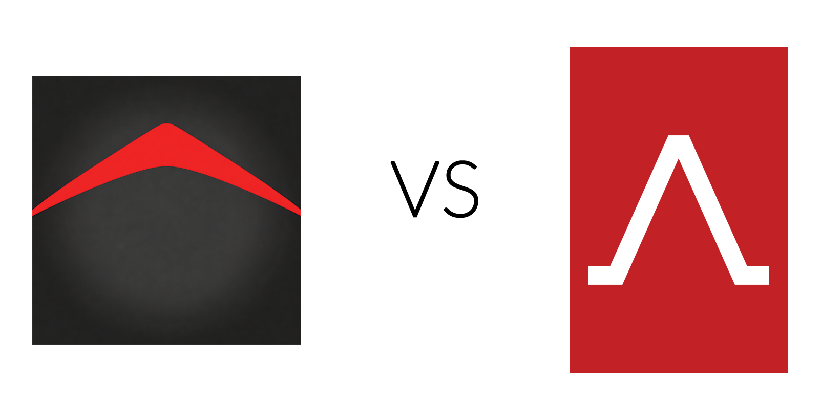
Within 60 days of launching the new, human-led identity, the client saw a 24% increase in brand trust scores and a significant lift in high-ticket lead quality.
Ready to give your brand a “Human Signature“?
If your brand identity feels like it was born in a server room rather than a boardroom, we can help.
Would you like me to perform a quick “Brand Identity Audit” for your current site to see where you might be losing trust?